Oh, I love the idea/aesthetic! Very cute and bright haha! Appreciate the effort ya put into it!
I wanna suggest some changes I think might be nice to incorporate before adding it right away, but will try and put some work into it and send them in a bit.
Sorry if this is a little bit too much, just figured it’d be nice to have a little more for ya since I was already making suggestions, but I think the banner’s lovely in its own right, too!
All the hashing is just some subtle shading, pretty much
All the red is some edits going top-down, left to right:
Make the clouds more definitive and in 3’s to make them seem a little more natural
With some mild shading that follows the “height” subtly of the top of the cloud
Make the c/splatoon part more wavy in the water and leaning only slightly towards “splatoon”, in the air
Or just putting it all in the air after moving the characters a little, too, potentially
Make the boat in the background a little more transparent and maybe move it around some after editing the text
Push the shoreline downward so it takes up a little less real estate and looks flatter to appear more like it continues outside of the frame
Also makes the eye more drawn towards the art and adds some flow to the pic too
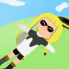
Move the left character to the right to fit a little more text; and potentially move the island right, too, so that it feels like it’s cut off to the right
Squeezing the left character’s arm in a little since it seems a little too oval-y, to me
And maybe changing the receiving end to a squid/octopus so it feels a little more blobby/shapey and pointed (and fun way to show a mechanic? haha)
Either way, I think it’s super cool what you’ve done so far and I’m mighty looking forward to what you can do in the future, too! :D
Edit: forgot to mention also making the waves come out from the shore lines a little more (in sets of odd numbers for that made-in-nature aesthetic!), with some foam/reflective, white coloring to them, too, potentially. 👍
I was thinking more hard cut-offs for the shading and less gradients, but I don’t wanna ask too much more cause I think it’s nice, regardless! Will put it up now, and awesome stuff!! ^^
P.s. Thanks again for making such a fun banner for the community and happy to have ya here! 😄
Add comment