OC Kbin Slim - A minimalist theme inspired by old.reddit.com
This is a repost of a link I posted in m/kbinMeta before I knew about this mag. Thank you @arkcom for turning me on to this sub! The text from the original post is quoted below:
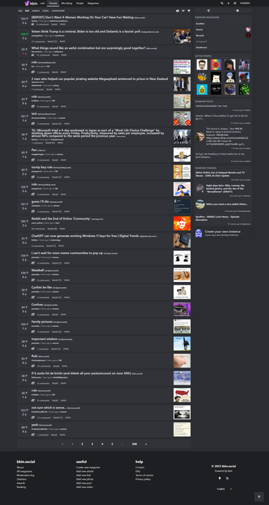
I love the idea of kbin, but I've found the UX could be improved. Honestly, I like it better than new reddit already, but I find it doesn't quite feel as nice as old.reddit.com to me.
This motivated me to throw together a stylus theme to give kbin a little more of an old.reddit feel. I got rid of a lot of the whitespace which pads out the site, and made some other tweaks I think make it look better. I've also replaced both the upvoted and downvoted colors with ones that are a little easier to read regardless of which color theme you're using.
This stylesheet should be compatible with any kbin UX configuration. Its been tested with every theme, compact mode, thumbnails, all 3 font sizes, and all of the other kbin user options. It shouldn't interfere with the mobile view either, however, all of the changes, other than the vote colors, are turned off since kbin's vanilla mobile view is pretty solid. (at least, imo)
I also tried to keep this accessible, using rem for most sizing, so if you configure your browser to have a custom font size, this SHOULD play nicely.
This is a WIP, so if you notice that anything is broken or ugly, please don't hesitate to let me know.
If there's any interest in integrating any of these styles into kbin proper let me know. I'd love to help kbin look beautiful out of the box, and I'd happily put in a PR, but I figured starting with a stylus theme would be safer since I'm not sure if the admins or community have an interest in these changes yet. Obviously if I did put in a PR I'd rewrite a lot of this to take better advantage of custom properties and integrate these styles into the kbin stylesheets less awkwardly.


Add comment