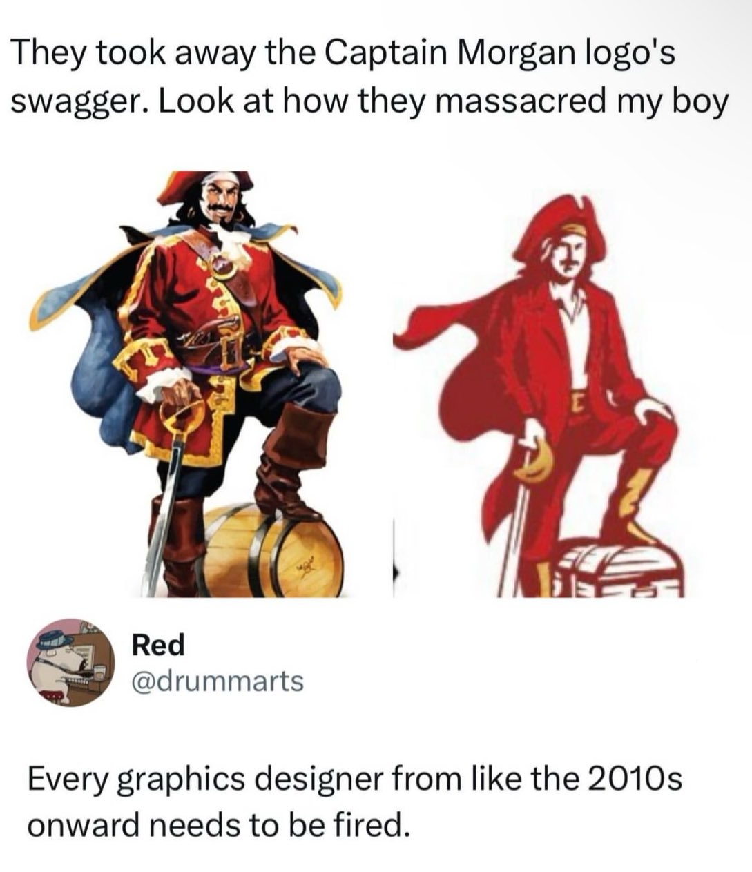
But did they have to make him pose like a misanthropic and unsatisfied middle manager who has been forced to have a souvenir photo taken at some local “pirate island” park in order to try and prove that deep down they’re fun in the company newsletter that no-one reads?
It’s not like Mr. Corporation said “Cleatus! reduce the colors needed to print this sticker! That’s what’s going to make us a profit for this quarter!” Instead, Cleatus and his logo team are incentivized to cut as much cost as they can because they get a bonus every quarter based on how much money they save the company. So someone on his team whose expertise is in label manufacturing for the company pointed out that they could save a fraction of a penny per sticker by reducing the amount and variety of ink it takes to produce the sticker.
That and/or someone in advertising has decided that now, statistically, is a good time to rebrand, and what I said above in combination with the current trend of minimalism means that this new logo fits all the criteria while saving money.
A man would really have to closely associate his individual identity and sense of security with brand marketing and politics to feel emasculated by a brand changing its logo. Or 10 brands or 100 brands or all brands. That would be a really pitiful excuse for a manly man. It’s like self-emasculation.
i have no idea what this brand is supposed to be but… tbh i don’t see anything wrong with the right one
logos are supposed to be simple-ish, use minimal amount of colors and be scalable and it sure does a better job with it’s reduced color palette and vector shapes
the one on the left should be reserved for e.g. illustrations
I kinda agree with it from an ease of printing perspective and easy perception from a distance, but they completely changed the proportions and got rid of the contrasting dark blue/red color-scheme that would catch people’s eyes. Looking at them side by side I’m still not convinced they’re even the same company, and that’s a failure for brand recognition in my mind which is the only reason logos even exist.
It’s probably part of an ongoing trend. There’s been sort of a renewed interest in legacy branding in some parts of the brewing world. I would say Miller kind of kicked it off 10 years ago when they rebranded Miller Lite using an updated version of their 1973 can. It was very successful. I actually did a marketing study on it for a project at work around that time.
Since then, several old beer brands have been resurrected. Hamm’s, Heileman’s Old Style, PBR, just to name a few. If you start seeing Fallstaff at your local liquor store, you’ll know we’ve come full circle.


Add comment