It’s the shitty contagion of Flat design. Back around 10 years ago or so, the Flat craze began and everything that had details or depth was pounded down into simple flat design. Now everything has to look basic and boring, and it sucks.
This doesn’t have anything to do with flat design. It’s the fact that people take hammers and look at everything as a nail and go pounding things. Everything like this is a “contagion”, people just latch onto hot button ideas and go crazy. Flat design in itself is fine, and extremely beneficial for what it was designed for, it’s just overused because people chase trends.
Before flat it was skeumorphism and that was even worse. You had everything in tech trying to look like real things which made things way too busy and hard to read. And then people tried to make it work on tiny phones with low res displays and it was difficult to use.
Hence, flat design was born as a solution. It made icons easy to read on tiny devices. And it did a good job at that. It solved a problem and did it well and everything was well and good.
The problem was the next step where people decided they needed “consistent branding” so they did it on their website too. And then their marketing materials. And then their products. Then you had a problem.
Flat design works well for what it was made for: iconography. And for legibility of small UI. But it’s not for everything. But people can’t think for themselves and solve different problems in different ways. And Google made it easily available everywhere. And people picked that up and use it everywhere. And THAT is the problem.
I think flat design makes sense for logos too, for the exact same reason it makes sense for icons. Flat logos are easier to recognize and see, especially from far away.
I’m not saying this logo great or anything but I don’t think it’s fair to claim that everyone using flat design is just a trend chaser.
I never claimed they were all trend chasers - my point was that it had a good place and then trend chasers over did it, and those areas are problematic. There is a place for it where I think it deserves to stay, but people have used it in the wrong places and overdone it in others to the point where the overuse had started showing issues.
I’d argue that designers don’t even understand why they use Flat design in ui’s. The purpose, as you said, is to reduce clutter. However designers don’t understand this and remove all context from all UI elements. What is interactive and what is static is no longer discernable.
I’m writing this in Thunder and nothing in Thunder’s UI shows any distinction between text that is interactive and text that is only text. You have to click the screen at random to see what happens.
Because of this, I’d argue that Skewmorphism is better because we have had 10 years of bad UI showing that designers do not know how to apply Flat design principles.
Skewmorphism is like garbage collection for programmers. A programming language doesn’t need it and is faster without it but too many programmers for too long have shown they can’t be trusted to write clean code.
I’d agree with everything you say about designers choosing to use flat designs without understanding the point. It’s definitely overdone and this becomes a problem.
But your argument for skeuomorphism is a huge stretch. We had ten years of skeuomorphism also showing it just straight doesn’t work in a lot of places. It becomes overloaded and hard to read.
But you’re comparing it to absolute off the deep end applications of the opposite. Why not somewhere in the middle? The entire argument you make for it is just that “well people understood what was click able etc” which is literally just basic design principles and nothing to do with skeuomorphism uniquely.
Why can’t we just expect UX people to do their jobs correctly? Why throw the baby out with the bath water in order to get a different baby we know has other issues?
We had ten years of skeuomorphism also showing it just straight doesn’t work in a lot of places.
We had 30 years of skeuomorphism starting with the Mac in 1984 and it always worked although suboptimal. Flat can be better but when not done right it’s worse than skeu. I personally would rather have a UI that is more cluttered but always discoverable over a UI that isn’t always obvious.
We can’t expect UX people to do their jobs in the same way we can’t expect programmers to do their job correctly.
I really like the simplicity of flat design. It makes things easier to find and recognize, especially for icons. Also easier for people with poor eyesight. It caught on for a reason.
Lemmy loves to shit on designers but there’s no way the designer had the autonomy to come up with this on their own. 100% guaranteed this idea came from marketing or an executive.
I don’t like flat design because it’s basic, boring, and sad. Windows 10 and 8 were ugly flat boring UIs for example. IMO peak GUI design was Mac OS X 10.6 like this:
Windows XP’s Fisher-Price design and OG iPhone lickable buttons were an excess we should have learned from instead of dumping altogether. It’s like music software started getting skins that were as non-rectangular as possible, and the whole industry went no, that’s silly, let’s stop.
Now you look at Windows 10 and it’s not even clear which parts of a window are connected. Windows friggin’ 95 had drop-shadows and relief shading. Why do modern OSs need to look like a Kraftwerk album?
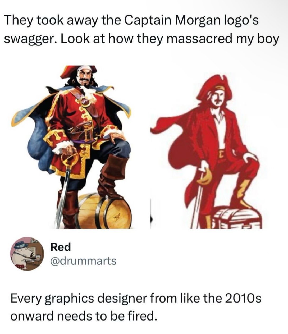
Even within that idiom, it sucks. His face is clearly-expressed through one dark blob - but it’s not a good face, or even a good expression. His jacket was opened for contrast… when it was already lined down the middle, for contrast. The line no longer conveys a barrel-chested manly man.
His hand gripping the pommel like a cane is a sign this was either nitpicked to death or done badly on purpose as a cry for help.
Art Institute really fucked us there. They taught “color by numbers”. Instead of teaching students how to make unique creations, they constantly hammered in “well this is what the corporate world wants right now”. What was “good” was creatively devoid and could be made by following a checklist. Had an ex who changed their entire art style, persona, and had business cards made up of some hexagon style because “hexagons are all the rage right now!”. Business card looked like something a beekeeper would hand you, not a graphic designer.
I’m so confused by the reaction to my comment. Do people think I said this rum was for successful business men? Or what I actually said that they see themselves that way.
I understand what you’re saying. I think you can interpret what you said in two ways that sound like you don’t know captain morgan: either you think actual successful businessmen drink it or you think people who aren’t successful but ignorantly think of themselves as successful drink it.
I think you’re getting downvotes because both of those groups wouldn’t drink captain morgan as a “sign of their success”
But did they have to make him pose like a misanthropic and unsatisfied middle manager who has been forced to have a souvenir photo taken at some local “pirate island” park in order to try and prove that deep down they’re fun in the company newsletter that no-one reads?
It’s not like Mr. Corporation said “Cleatus! reduce the colors needed to print this sticker! That’s what’s going to make us a profit for this quarter!” Instead, Cleatus and his logo team are incentivized to cut as much cost as they can because they get a bonus every quarter based on how much money they save the company. So someone on his team whose expertise is in label manufacturing for the company pointed out that they could save a fraction of a penny per sticker by reducing the amount and variety of ink it takes to produce the sticker.
That and/or someone in advertising has decided that now, statistically, is a good time to rebrand, and what I said above in combination with the current trend of minimalism means that this new logo fits all the criteria while saving money.
A man would really have to closely associate his individual identity and sense of security with brand marketing and politics to feel emasculated by a brand changing its logo. Or 10 brands or 100 brands or all brands. That would be a really pitiful excuse for a manly man. It’s like self-emasculation.


Add comment