GeneralEmergency,

They shrunk his shoulders, makes him look soft.

intensely_human,

They took the serotonin out of his posture. Makes him look uncertain.

intensely_human,

Looking closer they also removed muscle.

vox,
@vox@sopuli.xyz avatar

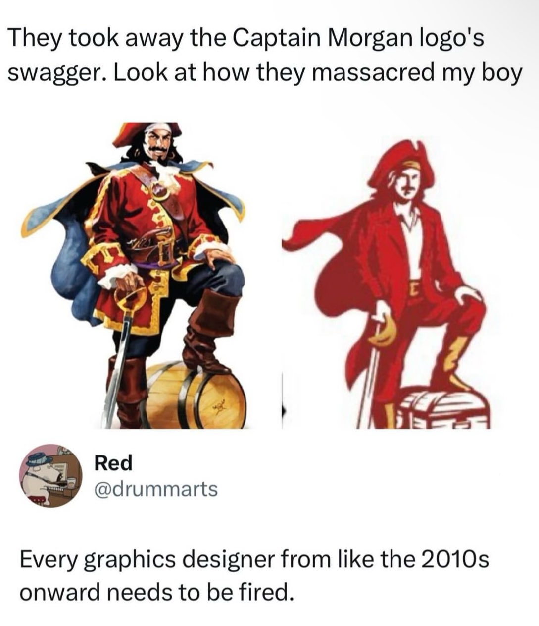
i have no idea what this brand is supposed to be but… tbh i don’t see anything wrong with the right one
logos are supposed to be simple-ish, use minimal amount of colors and be scalable and it sure does a better job with it’s reduced color palette and vector shapes
the one on the left should be reserved for e.g. illustrations

phorq,

I kinda agree with it from an ease of printing perspective and easy perception from a distance, but they completely changed the proportions and got rid of the contrasting dark blue/red color-scheme that would catch people’s eyes. Looking at them side by side I’m still not convinced they’re even the same company, and that’s a failure for brand recognition in my mind which is the only reason logos even exist.

jubilationtcornpone, (edited )

It’s probably part of an ongoing trend. There’s been sort of a renewed interest in legacy branding in some parts of the brewing world. I would say Miller kind of kicked it off 10 years ago when they rebranded Miller Lite using an updated version of their 1973 can. It was very successful. I actually did a marketing study on it for a project at work around that time.

Since then, several old beer brands have been resurrected. Hamm’s, Heileman’s Old Style, PBR, just to name a few. If you start seeing Fallstaff at your local liquor store, you’ll know we’ve come full circle.

SolNine,

Why did they turn him into the Tampa Bay Mascot Bucco Bruce?

NigelFrobisher,

Why is the new one Ryan Gosling playing a near-mute emotionally troubled man who dresses as a pirate?

dogsoahC,

I mean, as far as these new logos go, it’s not the worst.

metalcatknight,

Whoever drew this and whoever approved this need to walk the plank.

4am,

From Assassin’s Creed: Black Flag to Pringles

ByteJunk,
@ByteJunk@lemmy.world avatar

Old boy is about to pop open that keg and have a great time with the guys.

New dude is pondering investment plans to maximise return on investment from that treasure chest.

This is the definitive proof that money doesn’t bring happiness.

dessimbelackis,

Went from a pirate to a port town customs agent

flerp,

If you look at the people in advertisements, you see the demographic that the company is targeting to buy their product. If you think that’s what the new captain looks like, maybe it will be a successful change for the company, even if the loud voices on the internet don’t like it.

intensely_human,

New dude is grinning and hoping to be forgiven for showing up late to his niece’s sixth birthday party.

MalachaiConstant,

My guess is this saved somebody money.

Simpler design = fewer colors = lower printing cost.

Sometimes this can just be ink cost. Sometimes it can make discrepancies between printers less noticable.

Could still be the other things too

fhqwgads,

Generally it’s not much savings if any to do more than 1 spot color instead of full process cmyk. It might even be more expensive since it’s a new setup for the printer. Given the volumes they’re printing at it’s probably basically a wash.

exocrinous,

Okay but then why is he less buff??

threeganzi,

Less ink, obviously

Luvs2Spuj,

I heard somewhere before that often these simplistic logo changes are due to how they look on thumbnails, mobile devices etc. Unsure of the evidence there but it made sense to me. I still hate it though.

starman2112,
@starman2112@sh.itjust.works avatar

Can’t wait to download My Captain Morgan app and… Drink?

Jakeroxs,

Lol like when the iPhone was first getting big and there was those “drinking apps” where you turn the screen and pretend to drink.

maculata, (edited )

Rum is horrible anyway. Who cares. But yeah, terrible new mascot. The cosplay comments are spot on.

Edit: you want a gawdawful hangover? Rum is your copilot.

As little a hangover as possible? Straight vodka.

Sipping a complex drink with thousands of years of history? Proper single malt whisky from Scotland.

CoolMatt,

I like Rum with root beer

maculata,

I’m afraid you are incorrect. The root beer is fine though.

CoolMatt,

Ahh, well that’s okay at least you like root beer

maculata,

Food of the gods.

Hedup,

Say what you will, but that manager will now get a promotion for reducing the cost of production.

Melvin_Ferd,

Why would we stand for this. Take the streets. Bring your green hat.

ganksy,
@ganksy@lemmy.world avatar

Don’t worry they probably will be fired soon anyway

Fiivemacs,

They were probably fired before this was even degisned. I bet this is just AI generated crap that they thought was cool.

mindbleach,

Say we’re cool with the aggressive simplification and even the costume change. Why the fuck is it drawn worse? What is that facial expression? You could obviously have captured his salacious grin, in the screen-print blob version, or at least got his fucking facial hair right. Is that cashew fruit under his mustache supposed to be a chin divot? It looks like he’s going “Oohh.” What is his right hand even doing? Is he holding that saber like a cane? Gripping the pommel, rather than resting a hand on it? You could have made him hold the sword, upside-down, and it’d imply an air of danger, rather than indicating he’s unaware how a sword works.

And let’s talk about the costume change. You want a more readable logo? Something you can shrink, without losing the shape of everything? Your mascot wears gold-trimmed clothing. There’s literally a fucking outline around his coat. It’s not a color limit thing. You kept yellow in the boots and such. But now he’s wearing a modern suit-jacket over a polo shirt. What the fuck? This isn’t an aspirational figure. This is a rude depiction of your target audience.

Also: rum doesn’t come in chests.

TheGreenGolem,
@TheGreenGolem@lemmy.dbzer0.com avatar

No, that’s obviously a banana growing out of his hand.

mindbleach,

Oh right, a side effect of Professor Farnsworth’s fing-longer.

exocrinous,

That’s not a saber, sabers are curved. It’s a cutlass.

mindbleach,

Fair enough. Does that help explain why he’s using a pistol grip?

exocrinous,

Probably osteoarthritis

oatscoop,

curved … swords?

eestileib,

“This isn’t an aspirational figure. It’s a rude depiction of your target audience.”

I want you to know I really appreciated this line.

mindbleach,

We aim to please.

  • All
  • Subscribed
  • Moderated
  • Favorites
  • whitepeopletwitter@sh.itjust.works
  • slotface
  • kavyap
  • thenastyranch
  • everett
  • osvaldo12
  • rosin
  • mdbf
  • DreamBathrooms
  • khanakhh
  • magazineikmin
  • InstantRegret
  • Youngstown
  • Durango
  • Leos
  • normalnudes
  • ngwrru68w68
  • modclub
  • anitta
  • tacticalgear
  • ethstaker
  • GTA5RPClips
  • cubers
  • megavids
  • provamag3
  • cisconetworking
  • tester
  • JUstTest
  • lostlight
  • All magazines