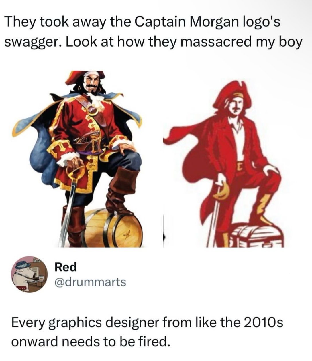
Ok I’m in a waiting room super bored so forgive my ridiculous takes, but the second one is probably a better logo even if the design is worse in a bunch of ways.
So, first lets look at Morgan as a brand. It’s a known brand, but not exactly top shelf stuff. From what I can find, they seem to be trying to change that, moving into the ready-to-drink and doing a bunch of social media stuff. they’ve moved from using artificial vanilla flavor to real Madagascar vanilla which is definitely more marketable no matter if it actually tastes better or not.
So as part of that they’ve redesigned basically all their labels and that means they need vibe with the modern upmarket design trends which right now are to use more type and negative space, and to ape design from the era around the 50s and maybe 60s. It goes with the current retro packaging design trend but doesn’t alienate older people like the 70s based stuff, which is usually aimed at a younger market segment. It’s old enough to feel “classy” even if the customer is old.
As part of that, the large illustration doesn’t fit. Printing full color like that in the era it’s aping was expensive so it feels out of place, and you just don’t have space for it if you want a clean look. So it’s got to be way smaller. The old label has the illustration as basically the main focal point - it’s huge. The new one has it as a small design point. The illustration just doesn’t work at that size. On a little 50ml bottle it’s going to be like 4mm high. Here’s a photo I found.
The new one actually reads pretty similar even though it’s like half as tall and only uses 2 colors. When it’s on a bottle that small and sitting next to Admiral Nelson and Lady Bligh which still use big full color illustratons on their labels can you tell which one is which?
But here’s the thing, the captain isn’t even actually the logo. The logo is the name, it’s the same logotype. They didn’t change that. They changed the mascot. It’s pretty important to note that there’s a big difference. A logo basically is your branding. It needs to work at any size, in any medium, and be instantly recognizable. That generally means it needs to be pretty simple. The Morgan logotype works great as a logo, but the mascot until now really didn’t. You can tell because if you look around there are about 50 different versions because the big full color illustration doesn’t work more often than it does. The new one will.
With all that defense I will say there are a few kind of dumb moves. The treasure chest is clearly a terrible idea. Like, if they were swapping it in on the non-alcoholic lines it would be kind of great but on everything it’s dumb. And I definitely would have fought for a puffy shirt instead of the collared one, if nothing else than for historical accuracy - I don’t think you can even wear shirts if the era unbuttoned with a collar like that. Edit- honestly they might be going intentionally anachronistic so that you can “cosplay” as the captain easily. Do the pose, hard cut to the captain logo, it writes itself. Which would be kind of clever but if that were the case I might have pushed the whole thing to be slightly more androgynous.
Anyway, I keep seeing this take over and over again, that everything is moving to minimalist blobs for logos, and while sometimes there’s definitely a point (the cross branding for Google’s apps on Android come to mind) a lot of the time there done just like this - with two large copies next to each other. And when you frame it like that of course the detailed one will look better. But when your logo has to shrink to 32x32px on a crappy Android phone or be printed like 5mm wide in black and white the simpler one is going to look way better.
Anyway thanks for coming to my Ted talk I guess.
Tldr: the guy isn’t the logo he’s the mascot and the new one can be printed small.
Fewer colors also makes it easier to reproduce in mediums where there’s a per-color expense, like shirts, embroidery, etc and works better when converted to greyscale. Keeping the same look across all merchandise is good.
This is all true. But he still looks like David Arquette instead of Dustin Hoffman’s Hook. They could have retained his swagger even with a simplified look.
I wonder if people are getting that impression since it’s a normal 7 or 8 heads tall now instead of 9 which is what the old one looks like. Making it closer to a normal human would make sense if there’s aiming for cosplay / self-insert type marketing. The more I think about it the more im willing to bet that’s the angle.
It’s only better as a logo because it’s a vector image and can be printed on everything. It’s worse in every other way, and they could have vectorized the original Captain without making him a narrow shouldered dweeb.
They’ve been editing him a lot too, comparing your bottle with the OP photo they removed half his cape and slimmed up his legs… for whatever reason they’re trying to reduce complexity and bulk overall. Maybe make him less “larger than life” and associated “toxic masculinity / XTREME” 90s-00s imagery going back to what, ya know, actual wrestlers and pirates and stuff would’ve looked like (minus the business collar)
I plan to play my preview of Ironsworn: Sundered Isles this weekend and you bet your ass that the OG Captain Morgan graphic is going to be one of the NPCs at some point.
Idk, I just threw "Alright me lassies, let's hit dem shores and fuck up the place for wenches and mead, yarr!" into a "English to oversanitized middle management gobbledygook" translation tool and this is what it spewed out.
Could have been worse - if they’d decided to redesign him in the 90s he would have just been a series of interlocking ovals, which was the style at the time.
Theory: they wanted to reduce label printing costs by reducing the color palette to three distinct colors… Still could have done a better job with the logo, though.
Ackshually depending on exactly how they’re doing the printing the new label might be slightly more expensive if they’re doing all spot colors. But they’re printing with enough volume it probably makes basically zero difference.
Of all places, rum bottles ain’t the place for flat design. One reason why flat design is often used is that it does well small as big, especially on a computer monitor.
Captain Morgan is a character that takes up the entire rum bottle. There’s never an instance where the Captain Morgan character is going to be as small as a fingernail.
And for some reason this designer felt the need to make the colors mute.
Look at all the different ink colours in the OG design. Those all have to be printed with spot colour ink. Maybe their printer is mixing CMYK themselves, but for a diago brand I doubt it.
The difference in the Reds of the new design looks like it is just shading. Which means, aside from the gold, you can use the same red ink for the entire logo.
How much money is being saved not having to constantly buy and restock all those different inks? How much has the redesign increased the profit margin for each bottle sold?
You thinking they’re doing like a million spot colors for that illustration? Id bet it’s all process color. IDK though I don’t have a bottle to look at on hand. If they are that’s pretty wild.
Retail printing something like the original label costs some 3 times more than the right… Making for a massive 3 or 4 cents difference on each label. Wholesale printing them has to be much cheaper, but the relative difference probably holds (so yeah, probably a fraction of a cent per label.)
Anyway, somebody probably saved a lot of money when you count each bottle for the lifetime of a printing machine. (Probably even more than they spent on the redesign.) And will get their bonus before the public has a bad reaction to the label.
This is the new Spiced Gold label. They did keep the barrel instead of changing it to a chest, but overall it’s not exactly what I’d call an improvement. They had the equivalent of Dustin Hoffman’s Captain Hook as their logo and they replaced him with David Arquette
Edit: also, he’s holding his sword like it’s a cane. Wtf lol


Add comment