As someone who doesn’t know about flags why’s everyone so sad about the missing tricolor? It seemed a little busy to me but Idk if there’s an importance I’m missing
This is going to be somewhat tool dependent but a good source of soil temps in general, especially for ag, is this site which has an interactive map link.
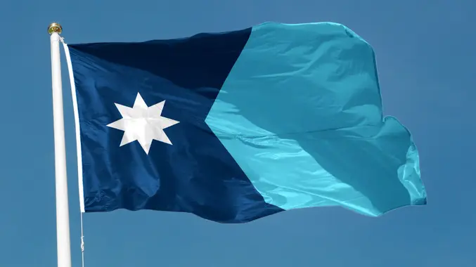
Honestly it’s lovely. It was never going to be Tripping Nutsack Minnesota, my favorite design and the real winner in my heart, but it looks good against the sky, and that’s the point. I like how it blends into the sky, that’s one of those things you can’t appreciate on a paper design.
The most important bit of the CGPGrey approved real flag, that clever stylized K that roughly represents the shape of the state and its relationship to the water, that’s still there, and thankfully the bar was low, and the old flag pretty meh.
I had to pull up Google Maps to sorta fact check that last sentence and like, goddamn. Why did we all let Michigan pretty much own the Great Lakes for itself? Minnesota just gets that one corner of Superior, which it has to split with Wisconsin, and otherwise Minnesota is landlocked. Of course Lake Superior is shared with Canada.
Meanwhile Michigan is the only one with its own Lake named after it, the only Great Lake that is all the way in the US and not split with Canada, and then it has direct access to Huron and Erie, both split with Canada, as well as Lake St Claire, because Detroit should have its own special Great Lake.
Then, of course, Michigan has direct access to Superior, as well, thanks to Upper. Also, because every Great Lake is just a matter of a long boat ride from Michigan, but I guess Ohio and Minnesota could say the same, the beauty of the Lakes is that they’re one big fuckin Lake.
That’s what we need. I need a live stream of somebody flying the new Minnesota flag on the bow of a ship, from Minnesota, all the way out to the Atlantic, and back. I’ll also be happy with a picture of the flag flying at launch, then at the Atlantic, and then anything in between. The important part is that the new flag gets broken in properly.
Also, if you missed it, Tripping Nutsack Minnesota, my favorite design, yes, this was a real submission:
They took a great design and made it mid. Pretty frustrated with the process. I might see if I can buy a nice sewn canvas of the original 1953 design to put up outside my house tho.
I wish they kept the stripes, but it’ll look really cool with the light blue swapped for a rainbow for pride merch in June. I guess buying one will be incentive to go out to Corporate Pride in Loring Park. :/
I too preferred the tricolor and that opinion seems to be shared with friends and family I’ve talked to. However, I still think this is a big improvement from the old flag and it certainly beats out some of the other proposed alterations.
Ultimately, I’m happy with it! Helps that light blue is my favorite color.
I liked it having 3 stripes as well, though this one isn’t bad. But the thing about this version that won over the rest of the commission was that, when you hang this one vertically, it looks like a perspective drawing of a river flowing off into the distance, with the North Star in the sky above it. So this design is symbolic both vertically and horizontally.


Add comment