QuarterSwede,
@QuarterSwede@lemmy.world avatar

So what is above average? 0.5°? 0.001°? This tells you nothing.

lemmyingly,

I assume this community and others like it on other instances are going to be just like the sub Reddit. Sensationalised data presented in a terrible way.

Before anyone jumps on me - I’m not saying the world isn’t heating up.

Nonameuser678,
@Nonameuser678@aussie.zone avatar

Terrifying to think what the next set of images are going to look like.

Glad I decided not to have kids.

Sdot,

I miss blue

Aatube,
Aatube avatar

I really want a full-res view of one of these little pictures so I can know where’s where

otter, (edited )

What little pictures, it’s just a photo of a sunrise /s

!misleadingThumbnails

Aatube, (edited )
Aatube avatar

The time scale on the left is literally in decades, how is this a sunrise

(judging by how you posted it there you don't seem to be joking)

Edit: Huh, so that sub is about illusions in the thumbnail, but I don't really think it looks like that

otter,

I should have included the /s, that’s my bad 😄

Infynis,
@Infynis@midwest.social avatar

dataisterrifying

qwertyqwertyqwerty,

The 2030’s will be brown, like burnt toast.

glimse,

I hate when they don’t include info on how to READ easily-shareable images like this. Put it in the PICTURE, science communicators! OP is in the minority here by providing the source.

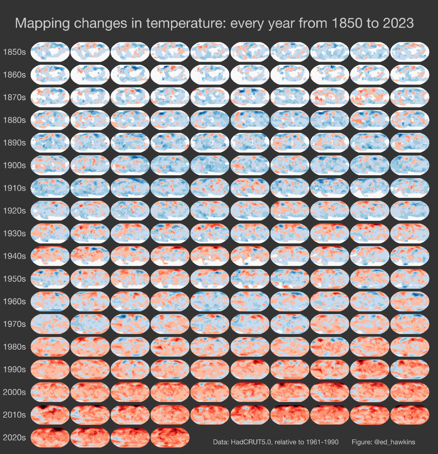
Red indicates a higher average temperature from the previous year. Blue is the opposite.

Masimatutu,

Thanks for pointing it out, I’ll add it in the description right away.

glimse,

Oh no, I hope you didn’t think my criticism was directed at you! You linked the source…most others would not. I’m mad at the writers who include these images and graphs without a key.

metaStatic,

/image of Bush pointing at graph with no marked axis

Norgur,

I'd just have thought they had some absolute scale going. It's a relative scale. This can lead to wildly wrong conclusions. Not in this case as the message would be the same mostly, but still.

Rhaedas,
Rhaedas avatar

Relative scale is worse. Not only that the temperatures keep going up and aren't a fixed "red", but that there's few to no blues now, meaning it's always going up everywhere. And this is actually a more calming way to present it that the usual exponential spike chart.

TonyToniToneOfficial,
@TonyToniToneOfficial@lemmy.ml avatar

We need a color that’s more alarming than red to switch to next

GreatAlbatross, (edited )
@GreatAlbatross@feddit.uk avatar

The temperatures are relative to the 1961-1990 average for that region, from the HadCRUT5 dataset.
Edit: I’m just going to find out if it’s relative to the average, or just lowest value is blue, highest is red.

The footnote detailing this is maybe a little unclear.

Also by Ed Hawkins: The climate stripes

bstix,

I’ll complain even further. What is even pictures of ? And what is the horizontal axis?

glimse,

I thought the horizontal axis was clear - it’s each year. Each row is a decade

bstix,

Yeah, but what are the pictures? Are they supposed to show the geographical globe or are they pixels of each day of that year or something?

Sure, the overall point is very clear, but it’s generally good practice to label everything. It’s not that I don’t believe the data, it’s just… What am I even looking at?

glimse,

That’s what I was originally saying. The image doesn’t TELL us anything, just shows us colors

SeaJ,

It’s average annual temperature for that area compared to the average of 1961-1990.

SeaJ,

Are we looking at the same source?

Technical notes: this graphic uses the HadCRUT5 dataset with ‘average’ defined as 1961-1990. The map for 2023 is based on January to September only; all other years are annual averages with at least 6 months of data available for that location. White areas show where not enough data is unavailable.

Blue is lower than the average for 1961-1990 while red is higher.

Fixbeat,

This is fine.

flint5436,

This is fine.

eager_eagle,
@eager_eagle@lemmy.world avatar

yup, we’re fucked

jabathekek,
@jabathekek@sopuli.xyz avatar

stress_migraine_meme.jpg

elouboub,
elouboub avatar

votes for right wing party that doesn't give a fuck about climate change

  • All
  • Subscribed
  • Moderated
  • Favorites
  • dataisbeautiful@lemmy.ml
  • rosin
  • khanakhh
  • thenastyranch
  • magazineikmin
  • InstantRegret
  • DreamBathrooms
  • everett
  • Youngstown
  • slotface
  • PowerRangers
  • vwfavf
  • Durango
  • kavyap
  • hgfsjryuu7
  • anitta
  • osvaldo12
  • tacticalgear
  • mdbf
  • GTA5RPClips
  • ngwrru68w68
  • cubers
  • ethstaker
  • modclub
  • normalnudes
  • cisconetworking
  • tester
  • Leos
  • provamag3
  • All magazines