Top 15 UI Designer Interview Questions and Answers in 2024 (medium.com)
UI designer interview requires not only technical skills but also the ability to communicate your design thinking and problem-solving…

UI designer interview requires not only technical skills but also the ability to communicate your design thinking and problem-solving…
For a long while, platforms have been making tons of usually pointless, often harmful changes to their UI. Reddit & Discord provide tons of examples....
Scrollbars. Ever heard of them? They’re pretty cool. Click and drag on a scrollbar and you can move content around in a scrollable content pane. I love that shit. Every day I am scrolling on my computer, all day long. But the scrollbars are getting smaller and this is increasingly becoming a problem. I would show you...
I'd like a keyboard shortcut to act in the same way as the toobar button "show sidebars":...
Today’s release also includes UI improvements, haptic feedback for navigation, and emoji for reacting to messages.

Links:...
The random posts/threads, active users sections seem like an unnecessary bloat, especially on mobile. Complete user details and magazine details shouldn't be listed on every post. An option to turn these off would be nice.
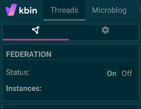
I've noticed that if I go to my subscriptions page I don't see any of the magazines I've subscribed to that are off-site (for example, beehaw.org posts and articles)...
This mod is a must-have if you're playing with a Steamdeck or with an Xbox, Playstation or Steam controller....
A curated list of delightful tools for digital creatives in a variety of mediums.
As things are I have to click on the link, whitch directs you again to the individual post and then you have to click AGAIN to make the image full screen. Thats also IF the image is viewable from KBin at all. Some times you have to click a link to see an image that is posted else where. Minor anoyance but images are a large part...
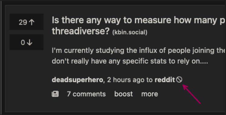
I can completely understand wanting to differentiate from Reddit, but to me, this is a matter of convenience and priority. Putting right after the article implies commenting on the article is emphasized. Putting it at the bottom of the comment page implies a want to comment on the comments....
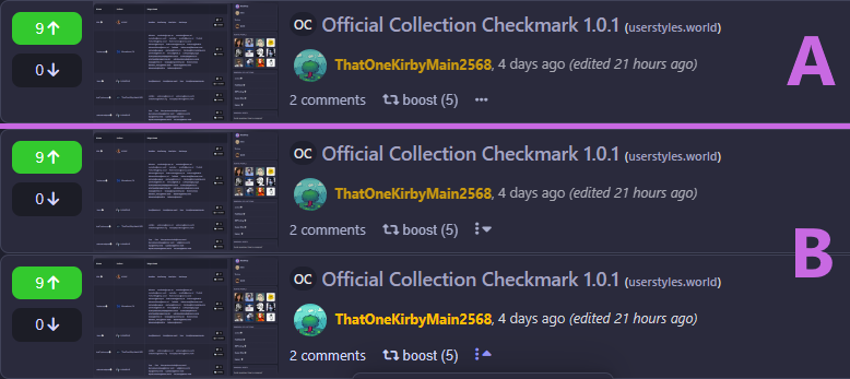
see attached image, but basically having the images on the right side makes it so hard to "read" a post with an image, going back and forth with your eyes to "get" the whole post. So much easier to just put the images between the up-/downvote buttons and the text post....

This site is getting better everyday, big shout out to @ernest , you're doing a fantastic job :)...

The UI overhaul is now stable.

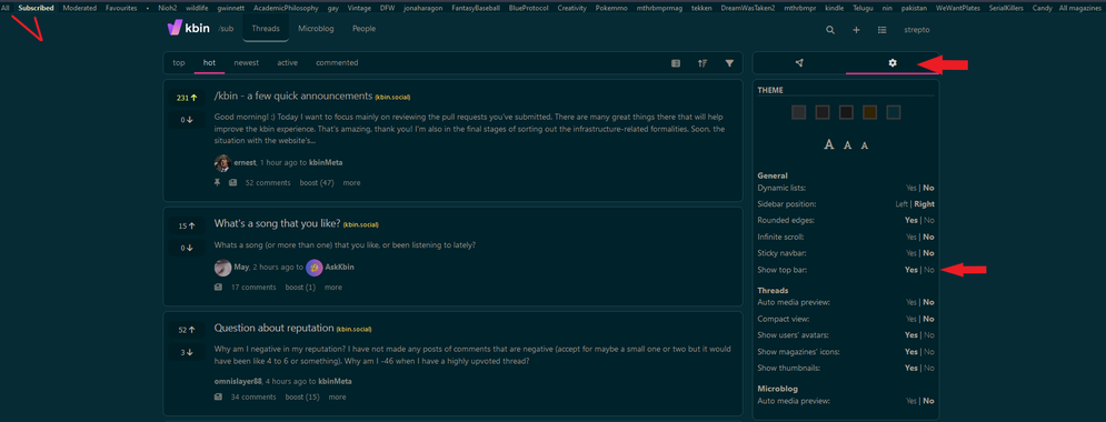
On desktop, click "Settings > show top bar (on)" to get a navbar at the top of the page that lets you easily sort between the default home feed, magazines you are subscribed to, and a list of random magazines to check out :)
I posted this in /m/kbinMeta, but I realized that it's probably a better fit here. I was going to post this in the bug tracker, but given more thought, I'm not sure what the best behavior is....
I was going to post this in the bug tracker, but given more thought, I'm not sure what the best behavior is....