@astro_jcm@mastodon.online
@astro_jcm@mastodon.online avatar

astro_jcm

@astro_jcm@mastodon.online

• Astronomer and science communicator
• Media Officer at the European Southern Observatory
• Won't shut up about space
#astronomy #astrophysics #scicomm #astrophotography #space
• he/him
• Toots in English and español
• 🇪🇸 → 🇺🇸 → 🇨🇱 → 🇩🇪

This profile is from a federated server and may be incomplete. Browse more on the original instance.

astro_jcm, to astrophotography
@astro_jcm@mastodon.online avatar

Have you ever seen an image where something looked off, like an oddly large or the where it shouldn't be?

I just wrote an article in the ESO explaining some methods and tools you can use to find out if these images have been doctored.

Check it out: https://www.eso.org/public/blog/csi-astronomy/

astro_jcm,
@astro_jcm@mastodon.online avatar

@btschumy Thanks, glad you like it!

astro_jcm,
@astro_jcm@mastodon.online avatar

@danielscher Thanks! Appreciated.

astro_jcm, to Astro
@astro_jcm@mastodon.online avatar

The Event Horizon Telescope has unveiled how Sagittarius A*, the supermassive black hole at the centre of our galaxy, looks like in polarised light, which tells us a lot about the magnetic field around this monster.

The lines overlaid on the image below mark the orientation of the polarisation, from which astronomers can work out the structure of the magnetic field around the black hole.

More details: https://www.eso.org/public/news/eso2406/

📷 EHT Collaboration

astro_jcm,
@astro_jcm@mastodon.online avatar

@65dBnoise Hi! We didn't intentionally hide this –– in the caption of that image we also explicitly mention that these lines are overlaid to indicate the polarisation angle. Ditto in the zoom video, where we fade them in on top of the original image.

astro_jcm,
@astro_jcm@mastodon.online avatar

@65dBnoise Sorry, I forgot to mention that there's a short illustration of how this works in our 1 minute summary: https://www.eso.org/public/videos/eso2406abh/ The animation itself is from EHT + Crazybridge Studios, it's a very cool visualisation of how polarisation & magnetic field geometry are linked.

astro_jcm,
@astro_jcm@mastodon.online avatar

@65dBnoise No worries, no offence taken! Feedback is always very welcome, and polarisation images are always tricky. Let me clarify a few things (multi-post thread incoming):

The word "overlaid" is in the image caption: https://www.eso.org/public/images/eso2406a/

In image captions we always include all the relevant details: filters used, how they were mapped to different colours, any other visualisation techniques used, etc.

Maybe you meant the lede paragraph, but that's trickier... 1/n

astro_jcm,
@astro_jcm@mastodon.online avatar

@65dBnoise In the lede you only have a few seconds to convey the gist of the result, so squeezing in here all the technical details about how the images were made is impractical.

Also, very often this lede will appear detached from the main image, depending on who reproduces the release and how they do it. So the key thing here is how to convey the core finding in a couple of sentences, keeping things simple but not oversimplified. 2/n

astro_jcm,
@astro_jcm@mastodon.online avatar

@65dBnoise After this quick summary, we then slowly elaborate on the details more and more as the text progresses, adding additional layers of information.

That way if someone stops reading at any point (and many people will), they will leave with a simplified but roughly complete version of the story, rather than a detailed but incomplete story if we started differently, focusing on the technical aspects first. 3/n

astro_jcm,
@astro_jcm@mastodon.online avatar

@65dBnoise As for "this not how it looks", that is true of every astronomical image. When we combine images taken through different filters, the final image will never represent how an object actually looks. Either because some of the involved wavelengths are outside of the visible range, or we mapped adjacent wavelengths to very different colours to highlight differences in composition, etc.

Polarisation is not that different: ultimately we're trying to represent something invisible to us. 4/n

astro_jcm,
@astro_jcm@mastodon.online avatar

@65dBnoise We always include all this information in the image caption. But, as I said earlier, it's very impractical to include these details also in the opening paragraph, where you're trying to convey the gist of the story.

We only have a linear story flow to work with, so we have to choose what comes first. 5/n

astro_jcm,
@astro_jcm@mastodon.online avatar

@65dBnoise With polarisation, when we're dealing with black hole images I personally tend to prefer other ways of displaying this, but opinions differ.

Here we did try to convey the visualisation method wherever suitable. It may not have worked for everyone, and I fully accept that it didn't work for you. But it's 100% not true that we were intentionally deceptive, as you said.

6/6

astro_jcm,
@astro_jcm@mastodon.online avatar

@65dBnoise The same thing happens with polarisation: lightwaves from astronomical objects oscillate in different directions, and our detectors register that. This is also actual physical information, just like wavelength.

The question is how to properly represent this, and what "properly" means. Again, I'm not a fan of the line integral convolution method for certain applications. It does involve arbitrary choices, but so does mapping filters to wavelengths. 1/3

astro_jcm,
@astro_jcm@mastodon.online avatar

@65dBnoise And this goes beyond mapping non-visible light into visible light. For instance, many astronomical images are shown with the famous "Hubble palette", which oxygen, hydrogen and sulphur mapped into different colours. Natively, all these filters are within the human visible range. But sulphur and hydrogen have almost the exact same wavelength, yet they're assigned very different colours, thus creating an artificial contrast that wasn't originally there. 2/3

astro_jcm,
@astro_jcm@mastodon.online avatar

@65dBnoise And even for those let's say "normal images" we get lots of questions along the lines of "is this how it really looks like?" A lot of my social media professional duties go into answering "no, but..." :D

I'm not trying to use this as an example to justify the LIC method, but I wanted to emphasise that even straightforward images are often hard to explain. 3/3

astro_jcm,
@astro_jcm@mastodon.online avatar

@65dBnoise Just to give you an example of how complex this can get: when the original (non-polarised) image of Sgr A* was released, we spent a lot of time trying to come up with ways to explain how this image was reconstructed from the interferometric data ("we" here is a lot of people, both from EHT, ESO and elsewhere, I'm just a small gear :D ) 1/n

astro_jcm,
@astro_jcm@mastodon.online avatar

@65dBnoise As opposed to the image of the black hole at the centre of the M87 galaxy, the Sgr A* one was much harder to reconstruct due to several factors, including the temporal variability of the source. There were several "flavours" of this image.

Back then we prepared a very comprehensive comms package, including not only the press release itself but separate blog posts and other material to explain all the subtleties that went into making this image.

https://www.eso.org/public/science/EHT-MilkyWay/

2/n

astro_jcm,
@astro_jcm@mastodon.online avatar

@65dBnoise I don't know if we succeeded at explaining how this image was actually obtained, and why in this occasion we didn't really have a single image but different "flavours".

I don't think this is fully comparable to the LIC method, I do see clear differences and there's certainly other ways to display polarisation info. I just wanted to clarify that many (if not most) astronomical results aren't "here's an image through several filters". 3/3

astro_jcm, to random
@astro_jcm@mastodon.online avatar

I really, really, REALLY hope they don't end up switching to a subscription model.

https://affinity.serif.com/en-gb/press/newsroom/canva-statement/

⚠️ reply-guy alert: yes, I also use Gimp and Inkscape. Move along.

astro_jcm,
@astro_jcm@mastodon.online avatar

@davesdogmaggie Exactly how I feel! Let's see how this goes.

astro_jcm, to memes
@astro_jcm@mastodon.online avatar
astro_jcm, to Astro
@astro_jcm@mastodon.online avatar
astro_jcm,
@astro_jcm@mastodon.online avatar

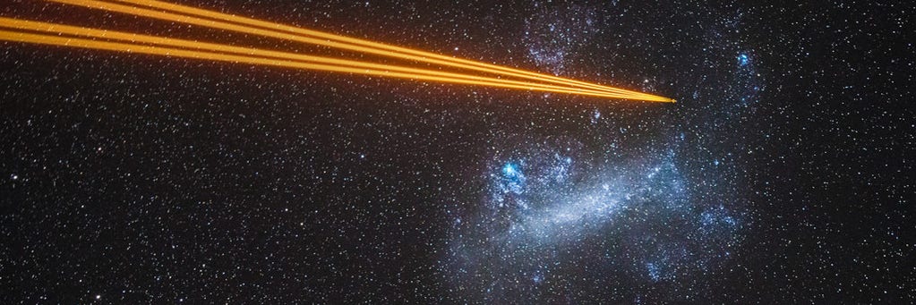
@Fu It's one of the four Auxiliary Telescopes at ESO's Paranal Observatory in Chile: https://www.eso.org/public/teles-instr/paranal-observatory/vlt/auxiliarytelescopes/

astro_jcm, to music
@astro_jcm@mastodon.online avatar

The latest episode of Twenty Thousand Hertz is a must-listen if you're a fan of Hans Zimmer. An interesting behind-the-scenes look at his scoring company Remote Control, featuring many of his recurring collaborators like the amazing Tina Guo and Loire Cotler.

https://www.20k.org/episodes/hans-zimmers-remote-control

spacegeck, to random
@spacegeck@astrodon.social avatar

Sometimes you just gotta do some heavy lifting and remove a few quadrillion trillion tons of burning hydrogen out of the way.

The same nebula, without stars to obscure the view.

astro_jcm,
@astro_jcm@mastodon.online avatar

@spacegeck It's been fascinating seeing this image take shape layer by layer. 🤩

  • All
  • Subscribed
  • Moderated
  • Favorites
  • JUstTest
  • cisconetworking
  • DreamBathrooms
  • InstantRegret
  • ethstaker
  • magazineikmin
  • Youngstown
  • thenastyranch
  • mdbf
  • slotface
  • rosin
  • modclub
  • kavyap
  • GTA5RPClips
  • provamag3
  • osvaldo12
  • khanakhh
  • cubers
  • Durango
  • everett
  • ngwrru68w68
  • tester
  • normalnudes
  • tacticalgear
  • anitta
  • megavids
  • Leos
  • lostlight
  • All magazines