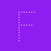
'Teranoptia is a #typeface without letters, a peculiar contraption that allows you to imagine chimeric creatures just by typing letters with your keyboard. Its design has been inspired by the Bayeux Tapestry and by medieval illustrations, as well as by children's books. You can use it to create border ornaments, to daydream about monsters or just to spice your layouts with #marginalia.'
Electric Blue is a rounded pixel typeface derived from Daniël’s experimentation with melting and conjoining pixels. It is a variable font with extremely bold and thin poles and a surprising switch in-between. The look of Electric Blue taps into the nostalgia of retro futuristic design from the Space Age ’60s and Neon Glow ’80s.
Released at @futurefonts
I made a #typeface called Astrograph. It's inspired by the typography on #StarTrek ship hulls and by fonts like Microgramma and Eurostile! Check it out and be sure to grab a copy if you plan on christening any starships any time soon.
With a nod to early American Gothics and European Grotesques and thanks to a clever curvature transformation across XCondensed and XWide, we’re delighted to introduce our latest #typeface Push by Christine Gertsch.
“Our primary #typeface is Sweden Sans. Sweden Sans is used to provide accessibility, simplicity, and consistency throughout all brand communications. Our #typography is as unique as it is easy to use. Inspired by the old signages system in #Sweden, it was designed to maximise its impact across all applications while keeping it easy to read, ownable, and highly recognisable.”
Helvetia (“Switzerland”) was the name used by some German foundries for a left-leaning #typeface that originated at Wagner & Schmidt. In France, it was known as Helvétiennes (“the Swiss”). English foundries called the light weight Engadine, after the region in the Swiss Alps (the bold was named Waverley, with no apparent connection to Switzerland),
For more than a year now I am working on my first own typeface in my freetime and just recently finished a first usable version of it.
While still unfinished, let me present it to you nevertheless:
I ended up cheating and using a font plugin (for now) because WP wasn't finding it in any of the usual locations.
Anyway, some of this is probably related to the plugin, and a bunch related to the theme (Origin) Maybe a crash course in css would help.
Overall, the font isn't any larger on my site [see above]. But the kerning is rather nice without feeling like block text. Numbers can be wonky where they're drop case a little in some instances
A local vinyl sign has gone wonky in the heat of the last several summers and accidentally created the greatest #typeface of all time.
(If you're a fan of signs, follow my Instagram account: https://www.instagram.com/signsandmarkers/