LaurenJodi, 
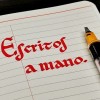
Practicing Italic #Calligraphy with the help of Calligraphy for Dummies. Tracing and copying technique is slow going but I feel like I’m getting the shape of the letters and working on muscle memory. Started with gel pen before moving on the #FountainPen.
gregorni,
yingtai, I learnt a little walking cursive in Chinese calligraphy class, but I never got round to grass cursive. So I've been working with this 1958 Yale University Press book. It's hard but it's so much fun to get my pen to do these wild gyrations!
https://www.goodreads.com/book/show/1232790.Chinese_Cursive_Script
rakyat, @yingtai I see! I’ve no idea cuz I’ve never learnt calligraphy beyond kaishu in school. It reminds me of how Arabic characters have very different forms depending on whether they appear at the beginning, middle or end of a word.
(And the calligraphy forms of words like 個 and 們 shows that simplified Chinese characters are often pretty rooted in “traditional” Chinese culture, despite what Taiwanese/HK ppl say.)
yingtai, @rakyat indeed! This book has really helped me see the beauty of a lot of simplified forms I always thought were ugly. Turns out they look a lot better in cursive where they originated!
Escritos_mano, Spanish Tu verdad, mi verdad.
#EscritosAmano
#Handwriting
#FountainPen
#FountainPenInkLover
#Calligraphy
carinealders, (edited ) Dutch Update: Problem solved! It reads: Es freut mich, daß Sie bis heute schon so große Erfolge erringen konnten. So wünsche ich Ihnen auch für Ferneres recht große weitere Erfolge. Nachdem die jüdische Musik doch bald ganz eingedämmt ist, wird für unsere deutschen Künstler wieder eine bessere Zeit kommen.
Dear German colleagues of #histodon ! Can any one of you transcribe this passage from a letter of 1933?
#German #musichistory #transcription #handwriting "#sütterlin @historikerinnen @histodons
Ardeija, Dutch @carinealders @historikerinnen @histodons I read your text snippet as "Es freut mich, daß Sie bis heute schon so große Erfolge erringen konnten und wünsche ich Ihnen auch für Ferneres noch große weitere Erfolge. Nachdem die jüdische Musik doch bald genug eingedämmt ist, wird auch für unsere deutschen Künstler wieder eine bessere Zeit kommen", even if the first sentence seems grammatically iffy (the word order is a bit uncommon, as if the writer perhaps rephrased the sentence during writing).
lulawitzescher, Dutch @carinealders @historikerinnen @histodons
Nice to see so many people willing and able to help. But I think it's German Kurrentschrift, not Sütterlin.
typographica, Apartment signs of the Grand Lake neighborhood, Oakland, CA.
#Lettering #Signs #SignPainting #1950s #1960s #Oakland #LakeMerritt #GrandLake
Photo of a reddish wood-paneled facade with a white sign in three sections: “The Empress 3952”.
Photo of a shingle sign on a wall. One panel reads “Available” in a bouncy slab serif. The second panel hanging below reads “One Bedroom” in a casual sans.
Photo of very large address numbers (“651”) painted in the side of a building.
vivdunstan, Normally I'm fine reading Scottish #handwriting from the mid 17th century. Even usually ok back to 1600. This 1656 testament not so much 😜 #palaeography #histodon #histodons #transcription #ink #ScottishHistory #17thCentury #SeventeenthCentury
chessert, That moment just before your fountain pen runs out of ink, when the ink flow is perfect! ✒️ 😀
letterformarchive, Jacket for The First Book of Jazz by Langston Hughes, pictures by Cliff Roberts, Franklin Watts, Inc., New York, 1955.
#LetterformArchive #LangstonHughes #CliffRoberts #JazzMusic #Lettering #BookJackets #BookCovers
gregorni, Want to take a sneak peak at the future of #Calligraphy?
#libadwaita #GNOME #apps #GTK #GTK4 #ASCIIArt #Figlet #Pyfiglet #ASCIIBanners #Text
A screenshot of Calligraphy's fonts list: The input field contains the text "Hi there!", and the output of all fonts can be previewed in little per-font cards, arranged in a two-column view. All the cards are titled with their respective font name, and have a button to copy their output.
The same view as before, but the window is quite narrow this time, and the preview are arranged in a single column.
A detailed view of a font: The input field still at the bottom (this time, it contains the words "Never gonna give you up"), the output view in the center. A copy button in the far right of the header bar.
paradoxmo, Gov. Newsom signs California legislation requiring cursive instruction from 1st to 6th grade: https://abc7news.com/cursive-california-schools-governor-newsom-teaching-handwriting/13926546/
josephdickson, @paradoxmo I hope this leads to increased appreciation all analog arts. Sketching, journaling, music, reading for pleasure from printed books etc.
samhainnight, @paradoxmo I'm glad they're requiring cursive in CA schools. As it is right now, public schools aren't teaching it but private schools are, creating an accessible gap based on income.
typographica, The Frasher Foto Postcard Collection https://oac.cdlib.org/findaid/ark:/13030/kt6s2019xp/ hosts over 5,000 picture postcard views of California and the Southwest taken by Burton Frasher in the 1910s–1950s. Among the many shots of landscapes and people are street scenes, offering a time-travel tour of early 20th-century American signmaking.
Tucson, AZ, 1938 https://oac.cdlib.org/ark:/13030/kt1199p910/?layout=metadata&brand=oac4
Randsburg, CA, 1934 https://oac.cdlib.org/ark:/13030/kt600018mv/?layout=metadata&brand=oac4
#SignPainting #Lettering #1920s #1930s #1940s #Arizona #California #NewMexico #Nevada #Utah
A neon projecting sign reading “MARTIN ROGERS / COLLEGE STORE / BOOKS ·· SUPPLIES ·· CAFE ·· GIFTS / WE SERVE Elite ICE CREAM”
A relief facia sign reading “CAFE / FOUNTAIN”.
A storefront with a large painted sign reading “ICE CREAM / JONES DRUG CO. / DRUGS SUNDRIES / SODA FOUNTAIN”
typographica, Santa Clara Street, San Jose, CA, 192?
https://oac.cdlib.org/ark:/13030/kt4870183w/?brand=oac4
stuartmarks, @typographica This is really cool. The Hotel De Anza is still there, as is the tallish building with the spire in the distance on the right side of the street. All the old signage is gone though. :-(
Paperposts, A quality piece of pavement #lettering found in Larkspur, CA.
Think it's dilbert in #cursive #script, but could say Lilbert, but never heard that before
ai6yr, @Paperposts Gilbert...
Paperposts, @ai6yr yes, thank you
penfount, #FPQuestion of the day:
What texts do you enjoy writing when you have nothing in particular to write about? (Pangrams, lyrics, nonsense phrases, book excerpts etc.)
#FountainPen #handwriting
Archergal,
inkycicada, @penfount I like to re-write lists I keep. something to do and then I end up with an updated one!
penfount, #FPQuestion of the day:
In an increasingly digital world, what do you feel is the value in writing with a #FountainPen (or #handwriting in general)?
AndreasDavour, @penfount like so many else, I find the physicality of it to be pleasurable. Also, find it's so much easier to brainstorm ideas on a page with arrows, boxes and ad hoc signs utilized to express my thoughts. No digital tool has come close to that. It really is a personal expression after all.
Suspect_Similar, @penfount For me is a question of speed. When your life is something like an endless meeting, it's much faster to handwrite notes and it's much more easy to carry a notebook and a pen than a laptop. The added bonus is that it's easier to remember the things that you have written by hand. And then there is the nice sensation you get from writing with a pen that you can't get with a keyboard.
pabloniusmonk, Eddie Bauer changed its logo because Gen Z doesn’t read cursive
After nearly 60 years of its distinctive cursive script, the outdoor retailer is ditching the script for blocky text and a goose. 🪿
“A big part of what I’m going to need to do here is reintroduce this great heritage brand to the next generation,” Bantle says. “And kids don’t even learn to read cursive in school anymore.”
https://www.fastcompany.com/90963252/eddie-bauer-new-logo-ditches-script-and-adopts-a-goose
Escritos_mano, Spanish
mike, @Escritos_mano What notebook is that? Very nice calligraphy!
Escritos_mano, Spanish @mike thank you! Is a gift from my job, so... Really don't know about it..
LaurenJodi, My Manuscript calligraphy set arrived this morning! I’m so excited to use it and improve 🥳 #FountainPen #Calligraphy
letterformarchive, Exercises in Flourishing from Real Pen-Work: Self Instructor in Penmanship, published by Knowles & Maxim, Massachusetts, 1881.
alexfortis, #calligraphie #calligraphy #fountainpens
Diamine Starlit Sea, shimmering ink.
Stub 0.8 and rather soft (for a steel) nib can have problem with line thickness consistency. Shimmering parts can stuck between nib and paper and then reduce line thickness. I will try Speedball dip nib, however it is no less tricky to use, bc you need to shake ink very often😓
paradoxmo, @alexfortis sounds like your stub’s slit isn’t open enough. I’d try the seven strokes to inky happiness: https://youtu.be/m_8QeO9n1zQ?t=501
alexfortis, @paradoxmo Thanks for advice, it seems to help a bit.
Escritos_mano, Spanish
paradoxmo, Spanish @Escritos_mano entonces no hay shimmer, ¿sólo sheen? ¡Hermosos colores y hermosas fotos!
Escritos_mano, Spanish @paradoxmo Si, tiene sheen y shimmer
0xabad1dea, I found my unfinished hand copy of The City of Ladies (feminism text from medieval times) Dutch edition
(inks: iroshizuku peacock green and morning glory blue, pens: pilot parallel and just a gold gelly roll for the gold)
erynofwales, @0xabad1dea This is beautiful!
starraven, @0xabad1dea
That is gorgeous. The simple gold outline on the versals makes a huge impact.
Escritos_mano, Spanish
paradoxmo, Spanish @Escritos_mano ¿Qué opinas de la tinta Rose Quartz? ¿Recibiste la tinta en Pelikan Hub?
Escritos_mano, Spanish @paradoxmo sí, obsequio de Pelikan Hubs.. Y no soy fan de los rosas pero me agradó bastante el color, buen shading y el tono es "muy cuarzo"
Escritos_mano, Spanish
abetterjulie, Spanish @Escritos_mano thank you!
Escritos_mano, Spanish @abetterjulie at your service!
maous, French Cette semaine j'anime un atelier de Lettering Créatif avec Pyramid Formations à Paris. On est en train de se plonger dans le dessin de lettres, et je partage des astuces pour aider chacun·e à développer son propre style.
Si ça vous parle, n'hésitez pas à en parler autour de vous. Le prochain atelier pourrait être avec vous !
maous, French Une création d'un participant, Olek Do 🌿 #burntherich