Graphics/UI and #ux are one side of the project, UX that is combined with functionality and design is a slightly different story. Looking at the project from the beginning I was wondering about the sense of mixing upvotes and likes. Of course, I know that this from the functionality of federated applications, but also in them...
The first approach to "warehouses", channels, rooms. Personally, I don't like the solutions seen on #reddit, but people seem to like them. And yet, the user interface is for people, not for themselves. At least to a large extent.
While reddit's layout isn't fully polished (many subreddit-related modules and pages still use the old layout), I decided to use a drop-down menu that I don't like and redesign it a bit.
@cutitdown@cody Minor correction. In fact, some images (thumbnails for magazines) actually have wrong proportions at the generation level. Anyway, the solution is the same. When I have some time, maybe I'll run my own instance and rewrite it a bit.
It is also possible that the amendments have already been committed by someone and are waiting for review.
Slowly but forward. Main pages with no content, but they are there. Blog without pagination, but it works. Currently, the font jumping on swap annoys me the most.
@ernest After the mechanics, RWD and content, it would be good to visually diversify the home page a bit, but we'll see how with time. Parallax in the hero/header section is a few minutes of work, but taking the time for more interesting animations can be problematic.
The subpage of followed channels, users and tags is still missing, but the general idea is already visible. GIF is animated.
I also updated the preview: https://bit.ly/3NRFQrH
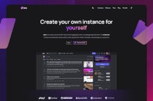
The fight, I suppose, mainly with CSS has begun. Such a simple design probably won't even require extending Astro's functionality. The blog and subpages are already working, and there is nothing else there. Well, except for the contact form. https://bit.ly/3OGpVN8
The first version of the user account settings layout. View with icons from the Tabler family instead of Font Awesome. Due to availability, license, number of icons and their variants, all existing icons will be replaced with Tabler icons.
By the way, I would like to add that what I "draw" here does not have a 1:1 reference to the work of the author of the site, because these are only my suggestions. It doesn't have to affect #kbin at all. It also doesn't mean that I'm right and everything is logical :) I just decided to help in the development of the project, but slightly from the side. Unfortunately, open source projects tend to live as long as the developer (usually one person) is motivated. And motivations are easy to burn out, especially in this type of projects.
As things are I have to click on the link, whitch directs you again to the individual post and then you have to click AGAIN to make the image full screen. Thats also IF the image is viewable from KBin at all. Some times you have to click a link to see an image that is posted else where. Minor anoyance but images are a large part...
And a kbin icon in #3d to complete the set. The mesh is far from perfect and the model itself is ridiculously simple, so there's no point in sharing the .blend file. #blender#kbin
@kris Upvotes and downvotes work and do the job, the problem is that they require a disciplined community and admins.
If the ratings do not affect the real ranking, users do not see the point in it, they get irritated and the service slowly but surely dies. It happened with digg, it's happening with its Polish clone, wykop.pl, and it's happened with several other counterparts.
Unfortunately, the natural course of things. The site becomes popular, money begins to appear, this affects the ranking through sponsored content and begins a slow decline.
upvote/downvote meets the needs you write about. If it works as it should. It is less important whether it will be an arrow, stars, hearts or any other object used to illustrate the functionality.
Though maybe thumbs up/down would be a better choice than arrows.
@cody My point was mainly that bundling these two technically and conceptually different interactions into what appears to be the same thing just with a positive or negative sign is not the best UI design wise.
Small changes. And by the way, checking if uploading video to kbin in any form is already working. Only now I noticed that font-display works differently on firefox compared to webkit
#fediverse logo in #3D for later use. Yes, I know that the colors do not correspond to the original, but the pattern itself is also an unofficial proposal.
Maybe after years and a few small attempts I will check if I can handle WebGL.
@ernest I only use blender to create web assets, branding, icons, etc. I'm a rather weak artist. I planned to expand my skills with animation, but it ended on the basics from years ago. In the fall I even bought an RTX4090 for this purpose, but it is still hanging in the PC unused.
Not entirely sure how possible this is, but it's a pretty large pitfall I just discovered. If someone links a thread in a comment and I click it, my browser will open the thread in their instance, not mine. Therefore, if I want to interact with the post they linked, I have to copy it, paste it into my instance's search bar, find...
@g8phcon2 Hi there! :) I chose this name a long time ago. It's a play on words. In Polish, the word "magazyn" can have several meanings depending on the context. Here's an explanation of its various meanings:
Magazine: It refers to a periodical publication containing articles, stories, or images on various topics, such as fashion, news, or entertainment. Magazines are usually published regularly, like monthly or weekly publications
Warehouse: It represents a large storage space where goods or products are stored before they are distributed or sold. Warehouses are used by businesses to store inventory or raw materials
Depot: This meaning refers to a facility or building where resources, supplies, or equipment are stored or kept. Depots are often used in the context of transportation, logistics operations
We are considering a change to something more neutral. Although I personally like this name, I would like to further investigate if the name is uncomfortable for others.
As things stand, I think the fastest way to get there is to click my name, then click Profile, then scroll all the way to the right to Subscribed - and even then the list I get is a) sorted by when I joined (rather than alphabetically) and b) spread over multiple pages when you're subscribed to enough magazines (meaning...
Font Awesome vs Feather Icons. CC BY 4.0 vs. MIT. Pack of 2020 icons vs 287. Despite the advantage expressed in numbers, I do not have feelings for Font Awesome. What's better? Or maybe looking at things like icons is just a designer's whim? #kbin#ui
@odddev Thanks. I know Tabler but completely forgot about it, and most of the listings now refer to icon search engines, icon selling platforms, not icon families. I guess I need to do some research after years and refresh this topic.
After a few hours spent with #astro, I can say that it is more pleasant to receive than #gatsby or #nuxt. Developer mode starts faster, hot reloading is no problem, build is also faster.
The biggest pain I caused myself, because I chose the standard approach to CSS for this framework. Lack of SASS or other preprocessor hurts a bit. However, I will not give up and will not install any.
If I hover over my name I can select "Notifications" and they there are hundreds (or thousands) of posts. Are any of them replies to comments I've posted? What are they? How can I see/find replies to the comments I have posted.
On the occasion of buying a license for Figma and putting Adobe Xd aside, I thought about creating a kbin system design ((unofficial, for testing figma and plugins).
But the post is not about that. I've been living for a while now and I still don't understand why designers stick to a full color palette. From 100 to 900 for each variant. Practice shows that no development team is able to implement it the way the ui designer dreamed. And this is regardless of the size of the company and the money spent on it. Not to mention pallet modifications.
I can't decide whether it's the designers' lack of knowledge that in ordinary SASS you can generate a practically full palette from one base color, or maybe the attitude that everything must be in line with their vision to the letter.
After all, the average user will not even notice the difference. Anyway, monitors have different settings, brightness, contrast, technology and screen quality and the effect will still differ from the designer's vision.
@cody Checkout Chakra UI we use it at work, and it's been far and away the best way to implement designs to spec from figma. Their variant and theme system is next level. We can access all those variants with just like "red.900" instead of having to use convoluted SASS functions.
@knoland I know chakra, in fact it's the same as what I'm writing about, only prepared and ready to work.
I'm not talking about the development side, but the masses of designers who spend days/months creating palettes, tints, shades. When in practice it doesn't really make sense. Whether the colors are generated in CSS, JavaScript or is a function built into a given framework is not so important. The point is not to do it manually because the marginal tonal differences in manual selection and generated shades will not be noticed by most users anyway.